Reliance Foundry

Reliance Foundry has been manufacturing safety bollards and site furnishings for over 100 years. Working as the Digital Design and Creative Lead at the company, I’ve delivered a full spectrum of design projects with a focus on B2B marketing.

VISUAL IDENTITY REDESIGN

Reliance Foundry needed a new identity that reflected on their 100 years in business, while looking forward to the next 100. The new logo asked to be modern, bold, and truly representative of the brand personality: experienced, innovative, creative. Visual accessibility through the brand elements was also important.

OLD LOGO

A dark grey rectangle with white text that reads: Reliance Foundry. Since 1925.

The old logo reflected a traditional aesthetic through the font selection, but lacked innovation and the dark grey didn’t stand out.

OLD COLOURS

Three blocks of colour: dark grey, neutral blue also called green-cyan, and a vibrant orange.

The colour palette was starting to look outdated, and completely lacked colour contrast to meet visual accessibility standards.

NEW COLOURS

Three circles of colour: dark blue cast iron, light grey steel, vibrant orange.

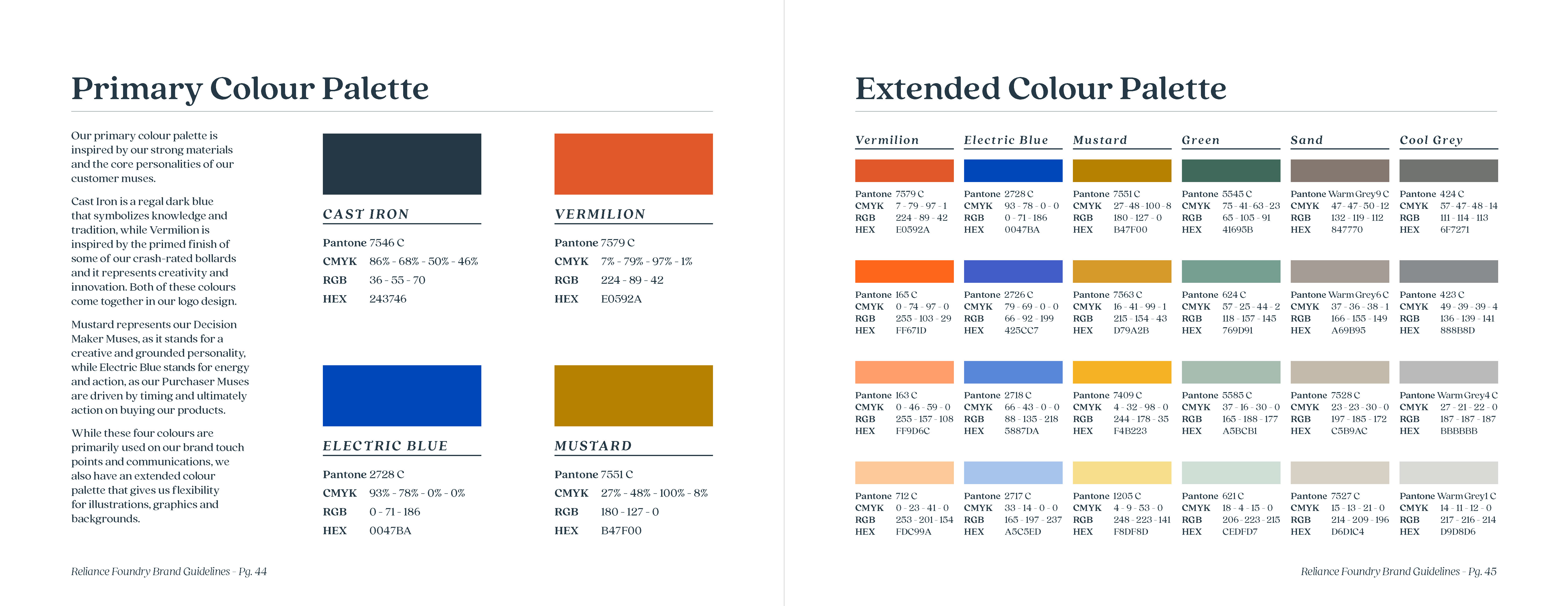
Inspired by core materials of their products, Cast Iron, Steel Grey and Vermilion symbolize authority, knowledge, strength, creativity and innovation. They can be combined in multiple ways and meet visual accessibility requirements.

NEW LOGO

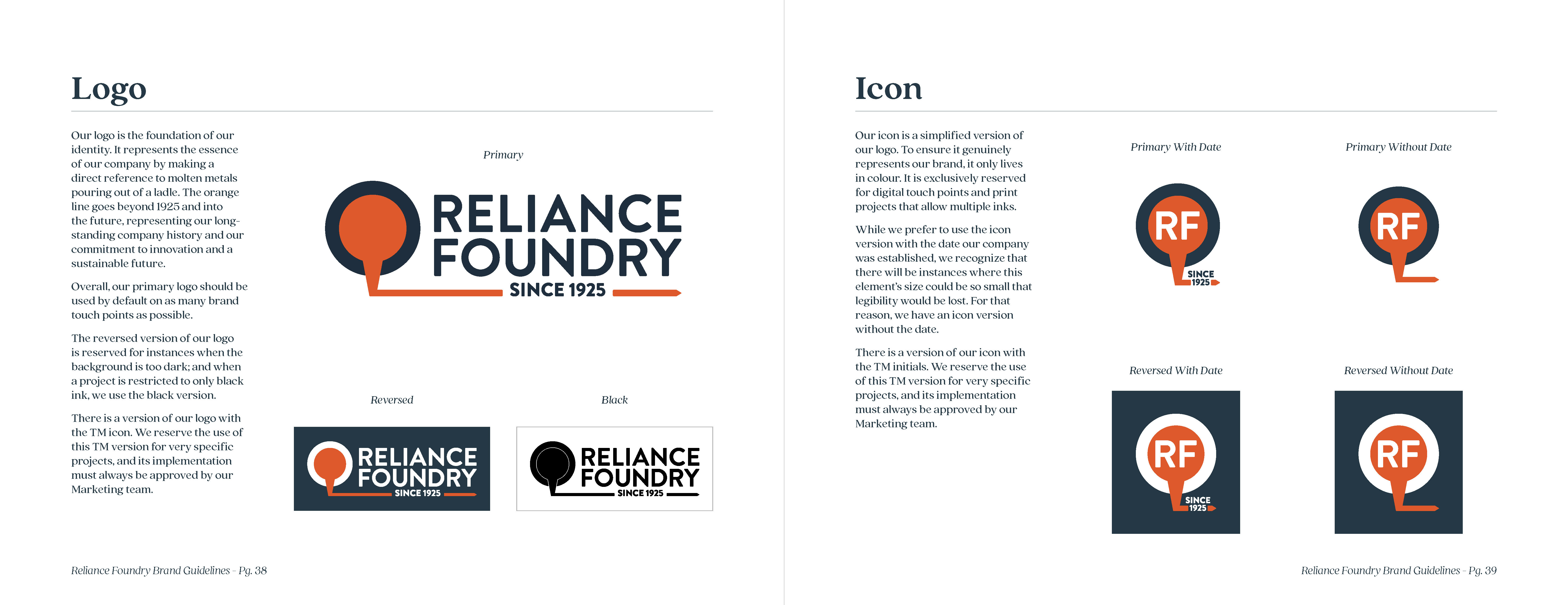
Graphic icon of molten metal being poured out of a circular container. Text reads: Reliance Foundry. Since 1925.

The new logo leans on the foundry aspect of the company, with the molten metal going through 1925 and expanding beyond into the future. The bold sans serif modernizes the brand, while the vibrant Vermilion colour stands out.

BRAND GUIDELINES
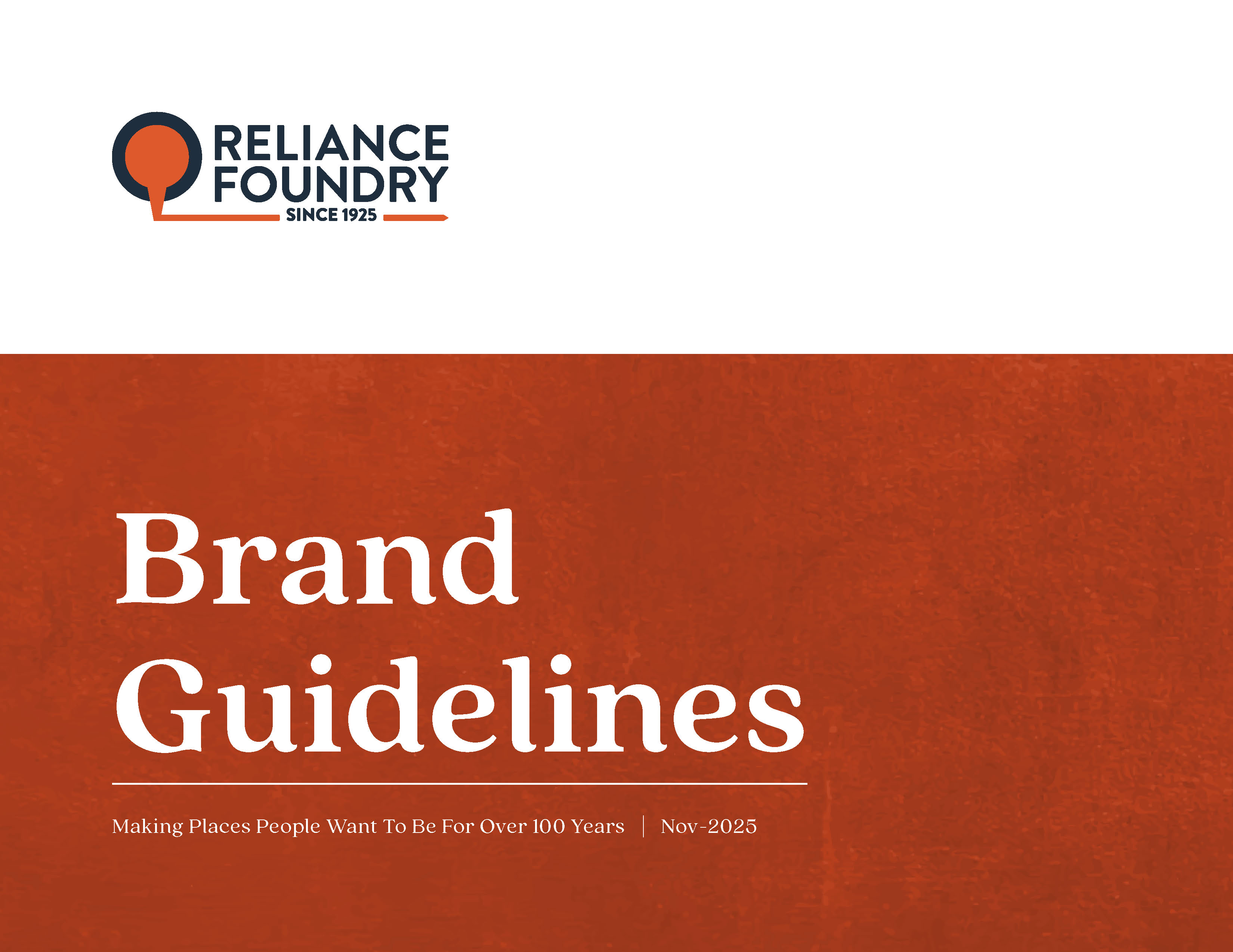
  • Brand book cover page with a vibrant vermilion textured background and white text that reads: Making places people want to be for over 100 years.
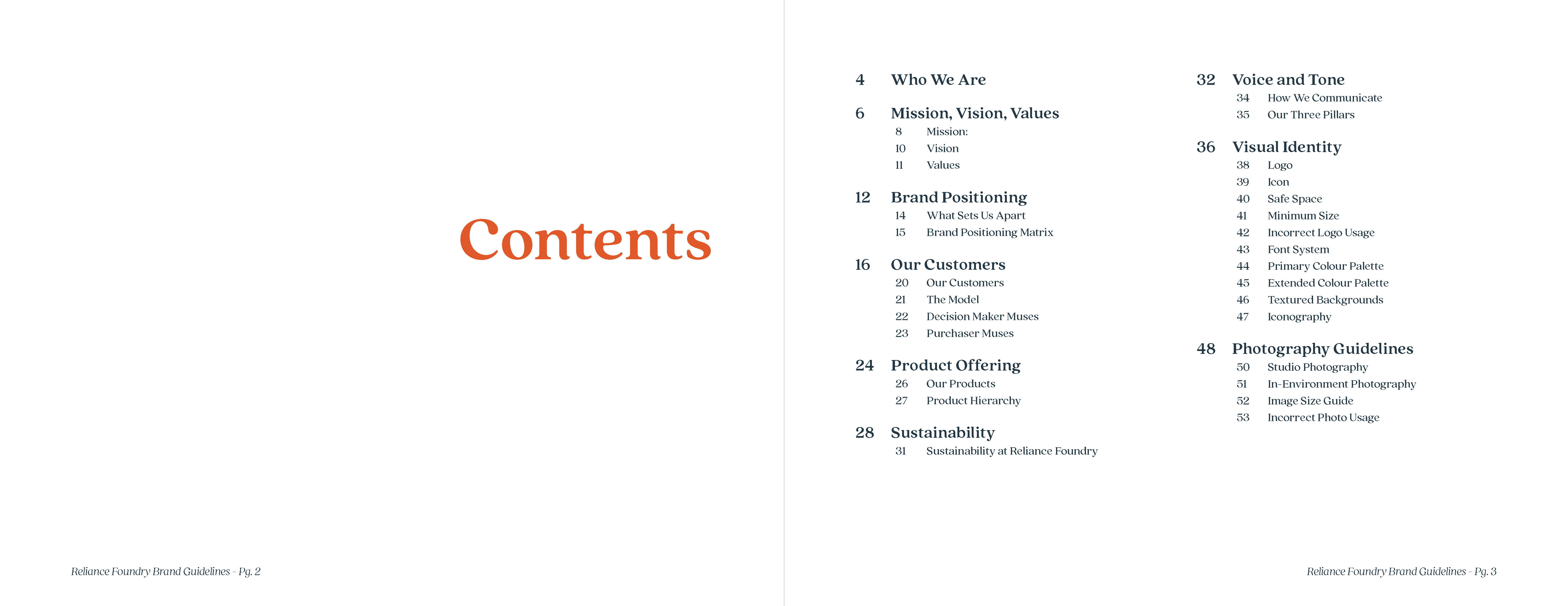
  • Contents spread
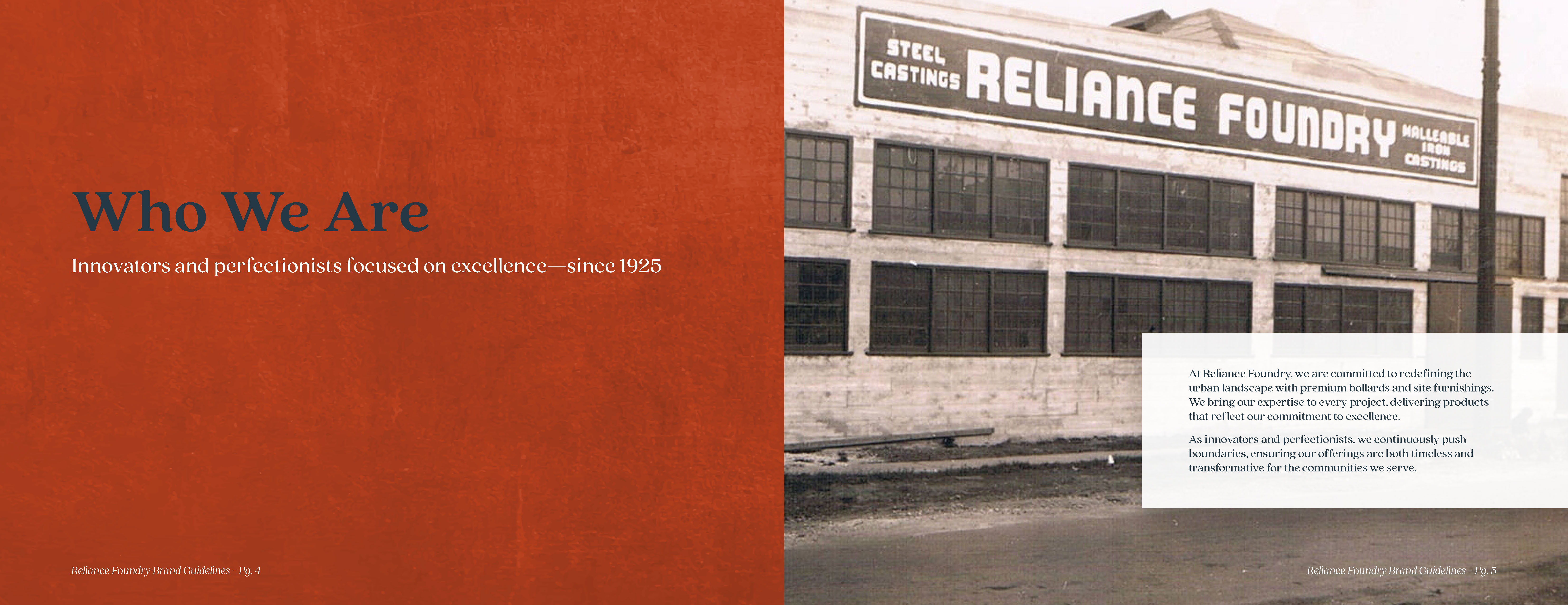
  • Who We Are. The old foundry building facade is shown with a retro signage that reads Reliance Foundry.
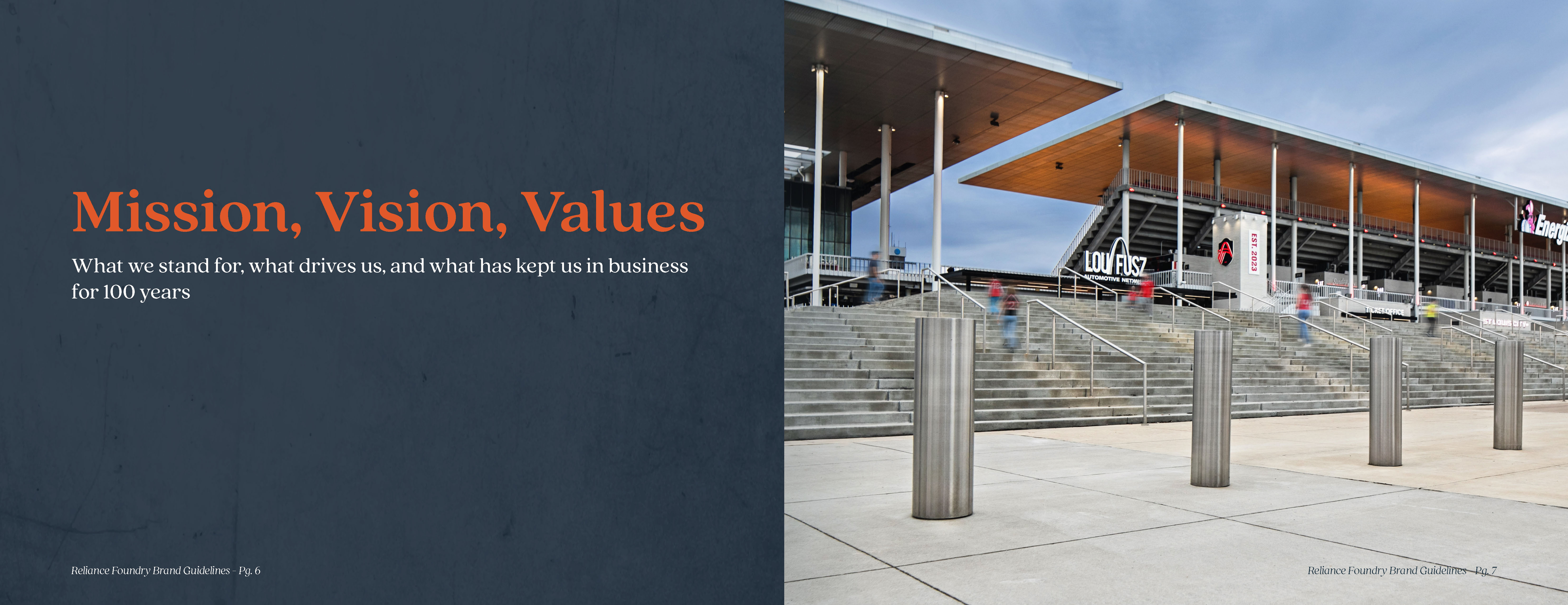
  • Mission, Vision, Values. A photo of slanted stainless steel bollards guarding the entrance stairs at Energizer Park in Saint Louis.
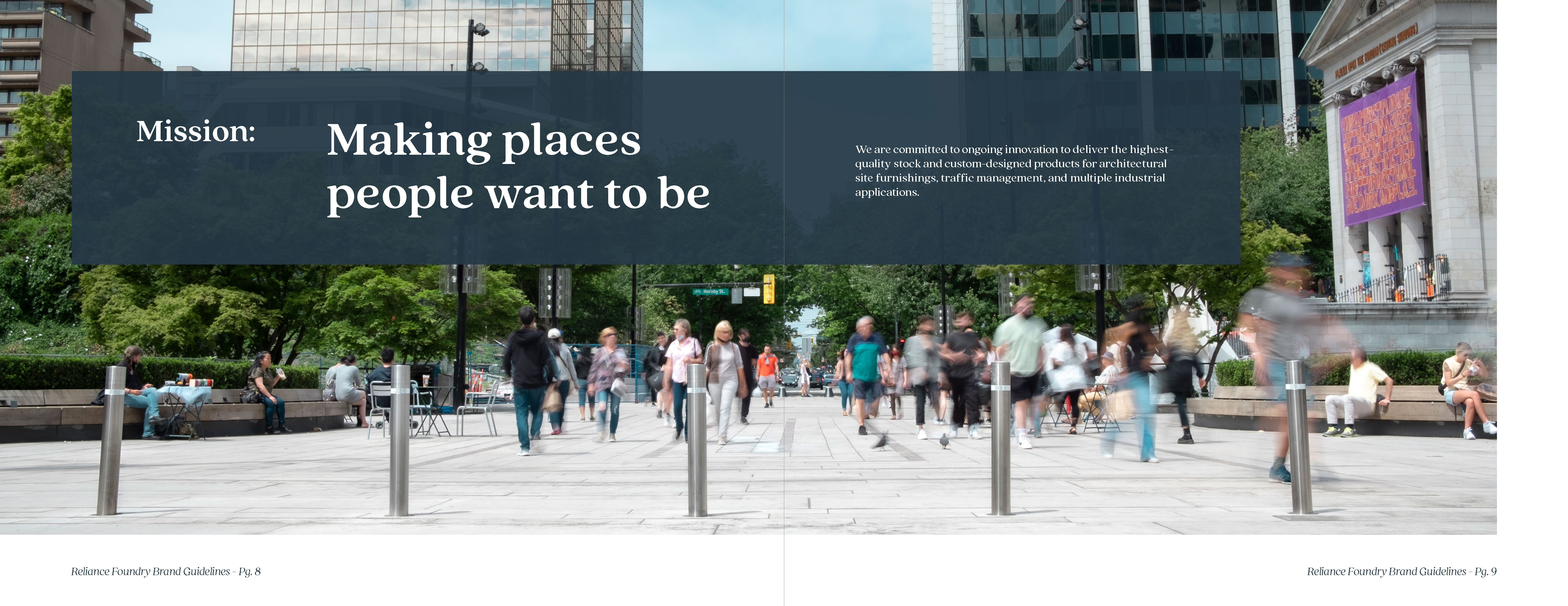
  • Making places people want to be. That's Reliance Foundry's mission statement, and it's laid over an immersive view of stainless steel removable bollards at Vancouver Art Gallery's plaza.
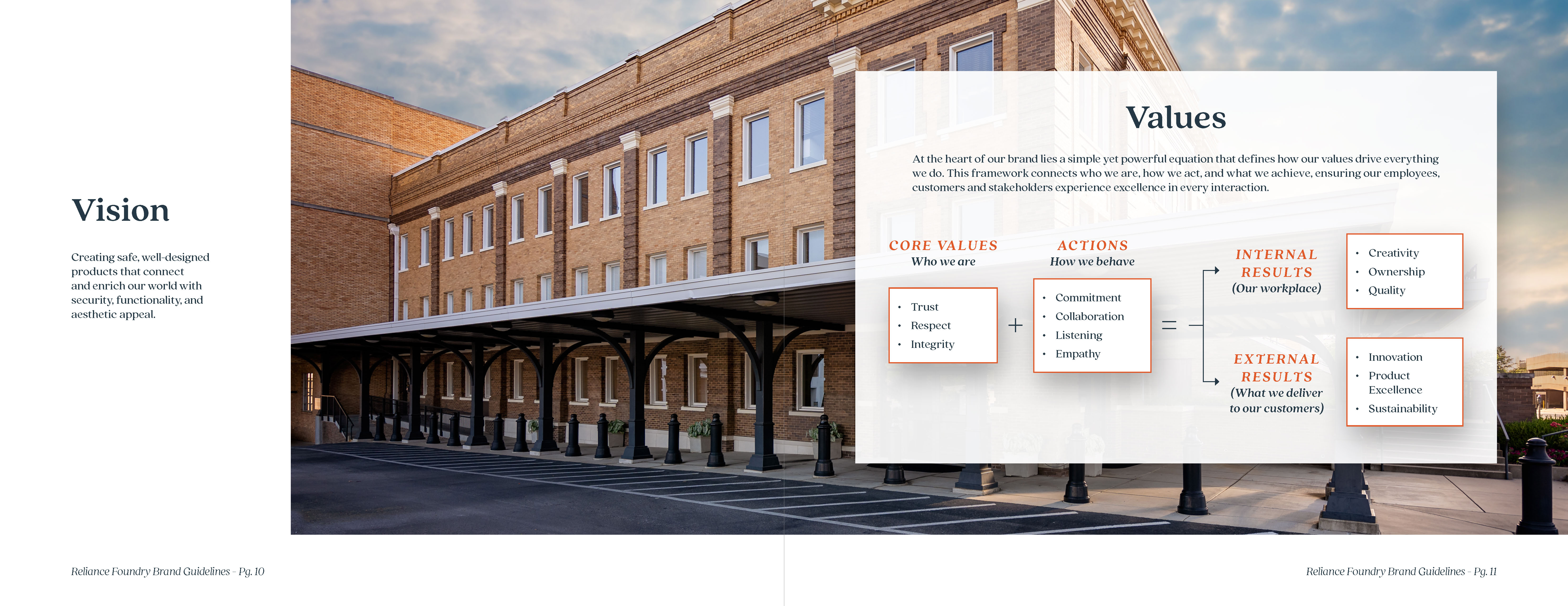
  • The Vision statement and company values for Reliance laid over a wide shot of a large brick building with arched porch accents and decorative bollards guarding its side.
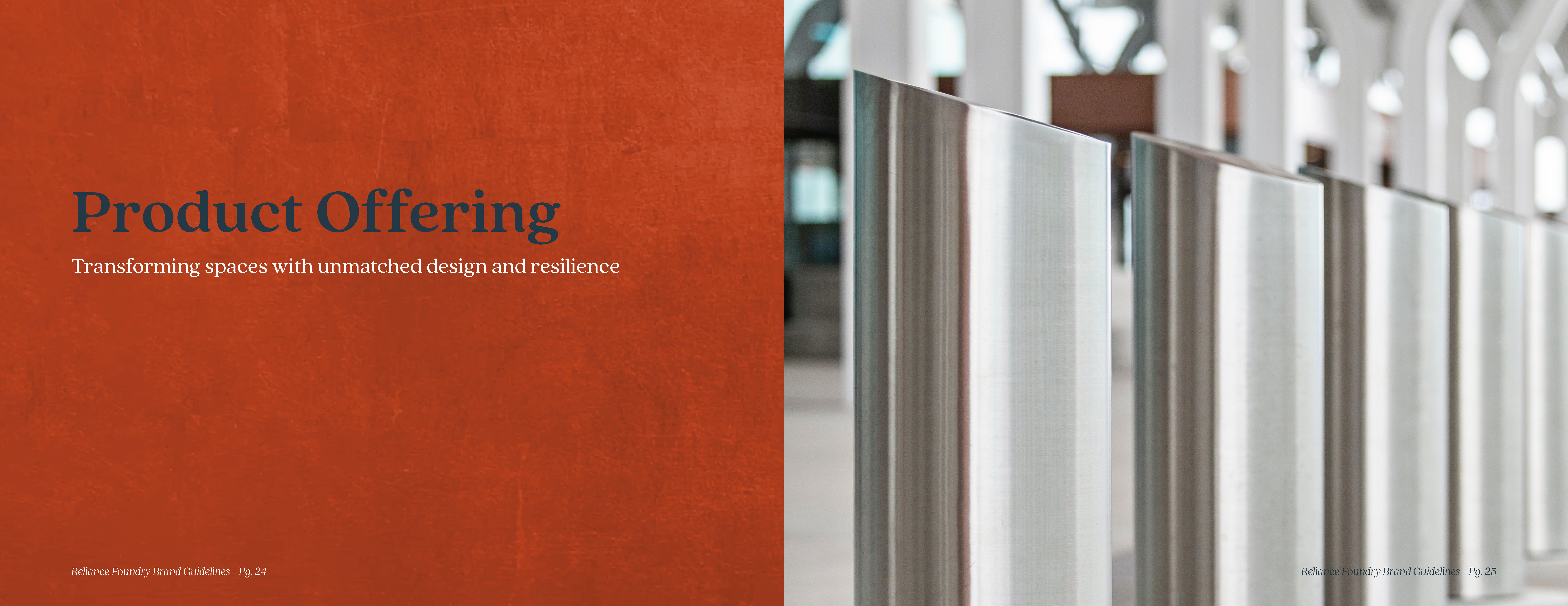
  • Product Offering. Close up of slanted stainless steel bollards.
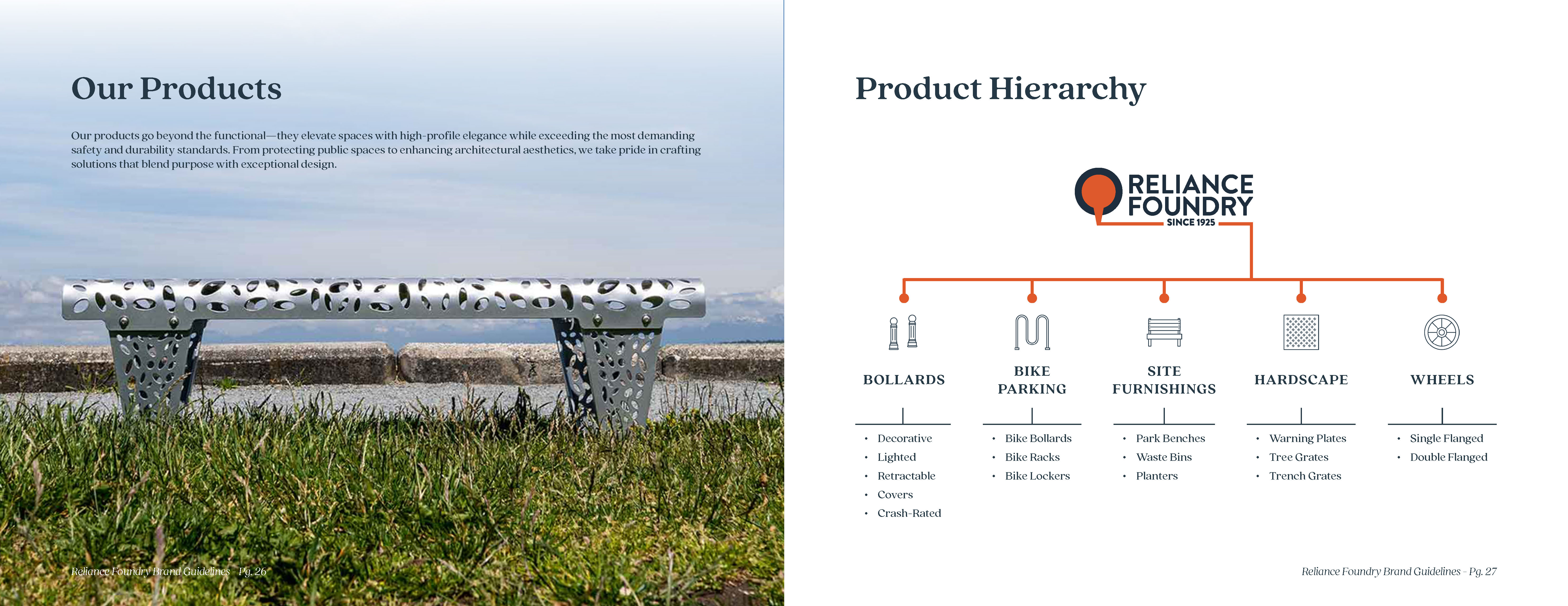
  • Double spread of the product offering. Left page has a photo of a silver bench with laser cut ovals over a vibrant grass area in a park. Right page has a diagram of the product hierarchy, listing product categories with their icons.
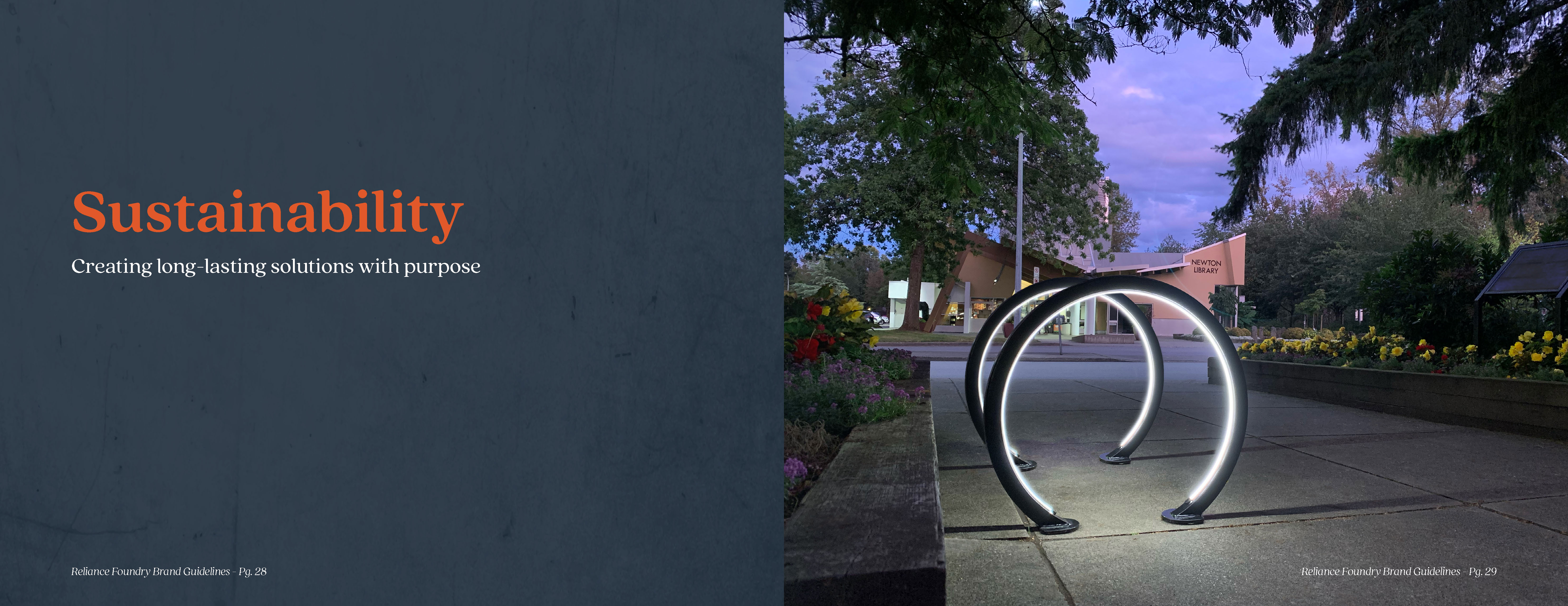
  • Sustainability. Evening shot of a series of round, lighted bike racks next to flower gardens at a public building.
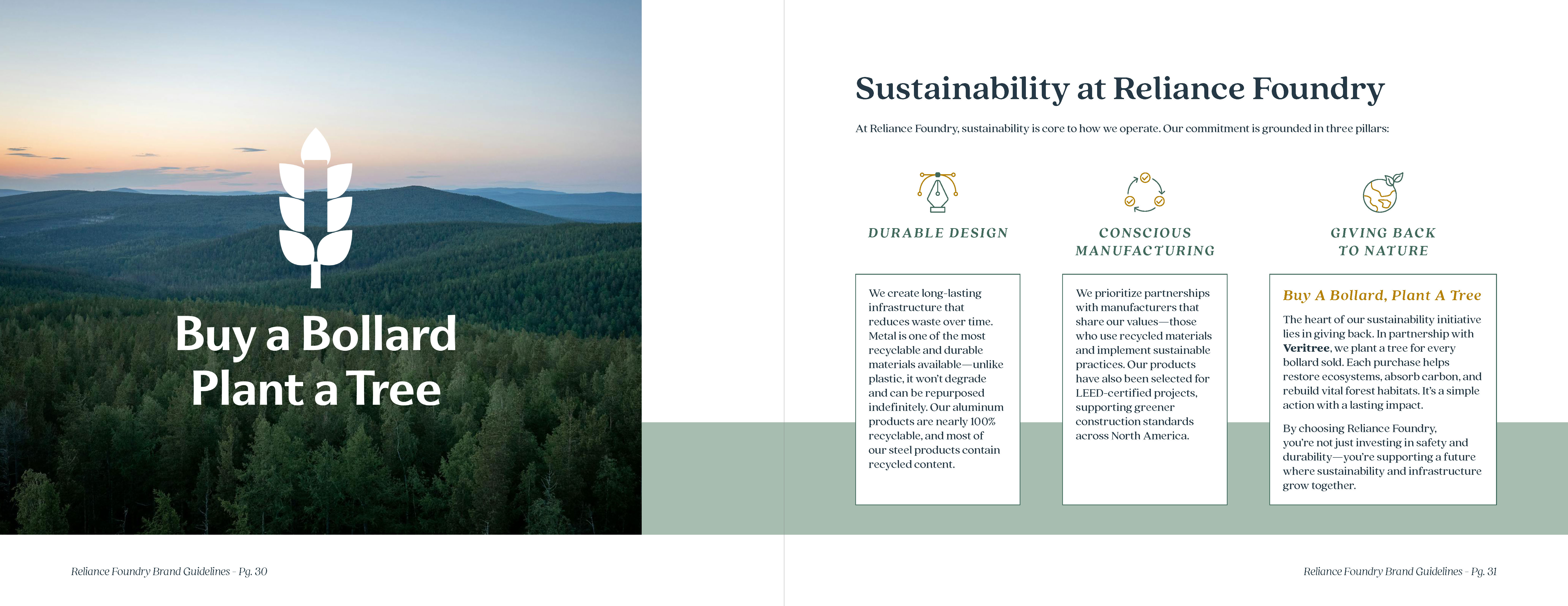
  • Sustainability double spread. Left page has the logo for Buy a Bollard, Plant a Tree over an aerial view of lush, green hills. Right page has the 3 pillars of Reliance's sustainability initiative: durable design, conscious manufacturing, and giving back to nature.
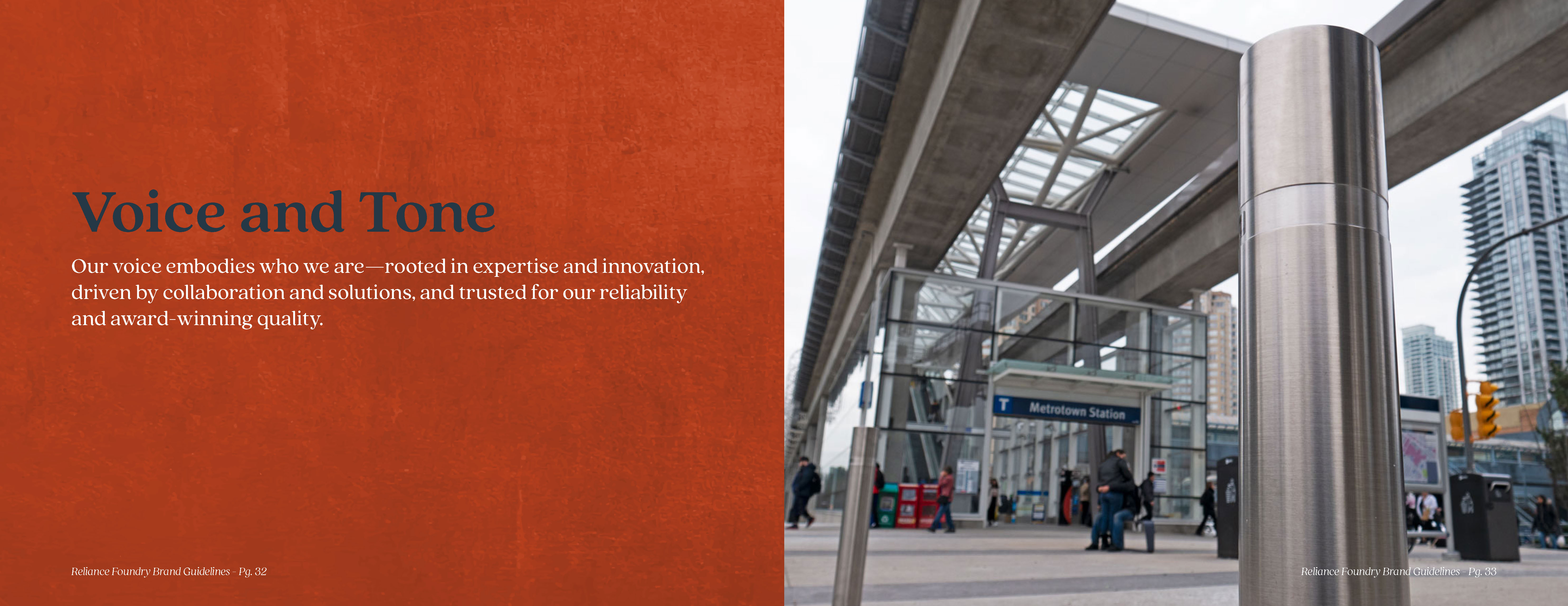
  • Voice and Tone. Low-angle view of a stainless steel bollard guarding the pedestrian entrance to Metrotown Skytrain Station.
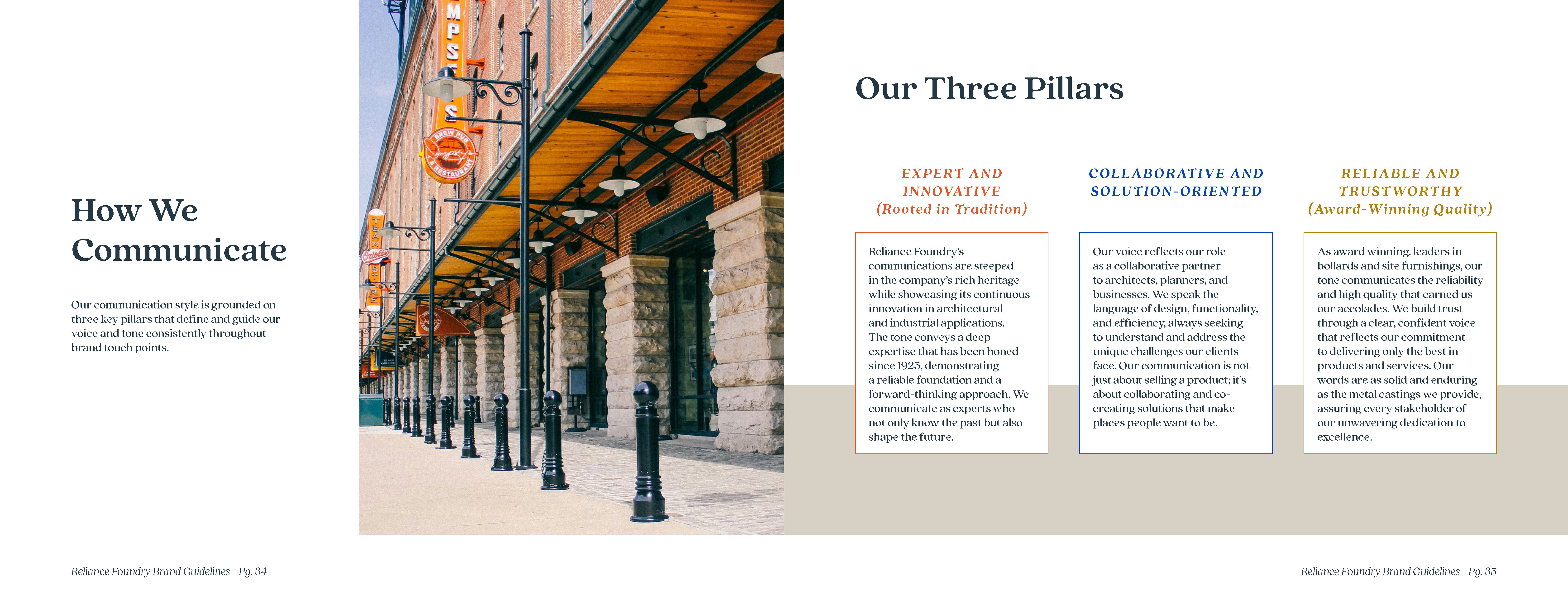
  • Voice and Tone spread. Left page has a photo of a classic round-cap traditional bollard at the entrance of Oriole Park. Right page has the 3 pillars of communication: expert and innovative, collaborative and solution-oriented, and reliable and trustworthy.
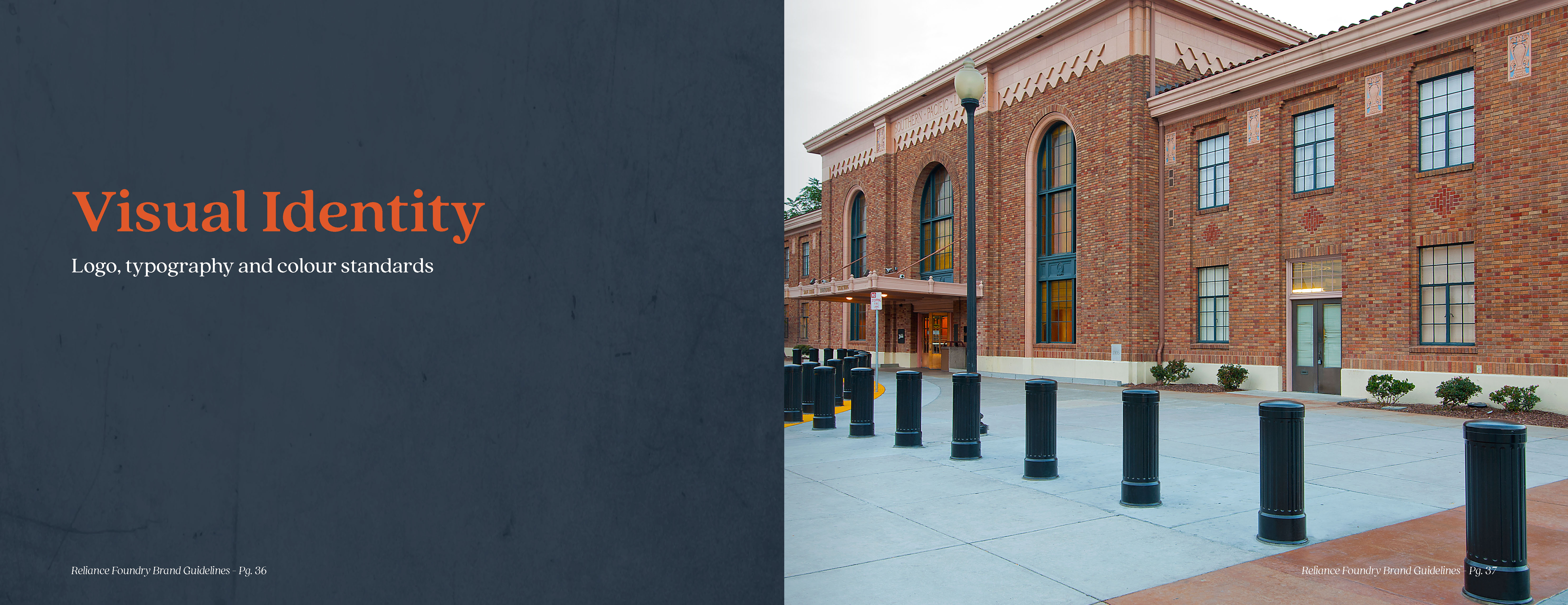
  • Visual Identity. Photo of a historical brick building with robust, traditional bollards protecting the sidewalk and main entrance.
  • Spread presenting the logo, icon, and their variations.
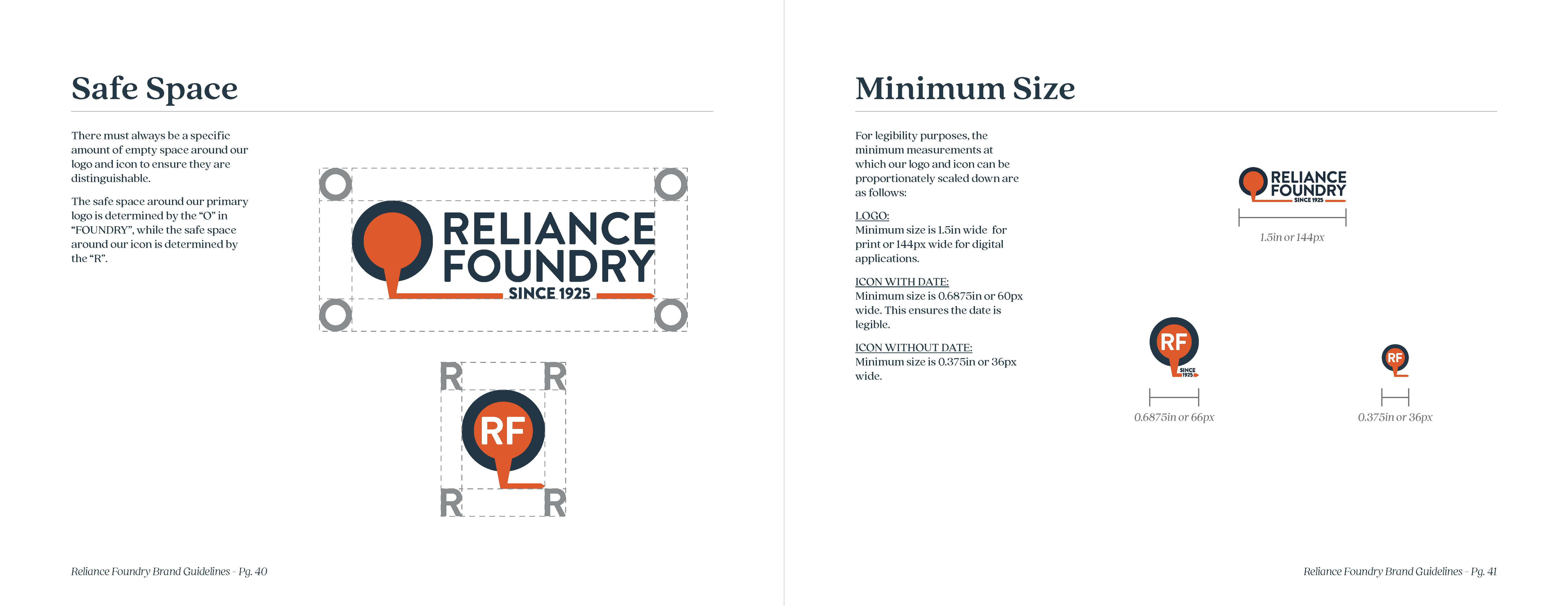
  • Spread explaining the safe space and minimum size parameters for the logo and icon.
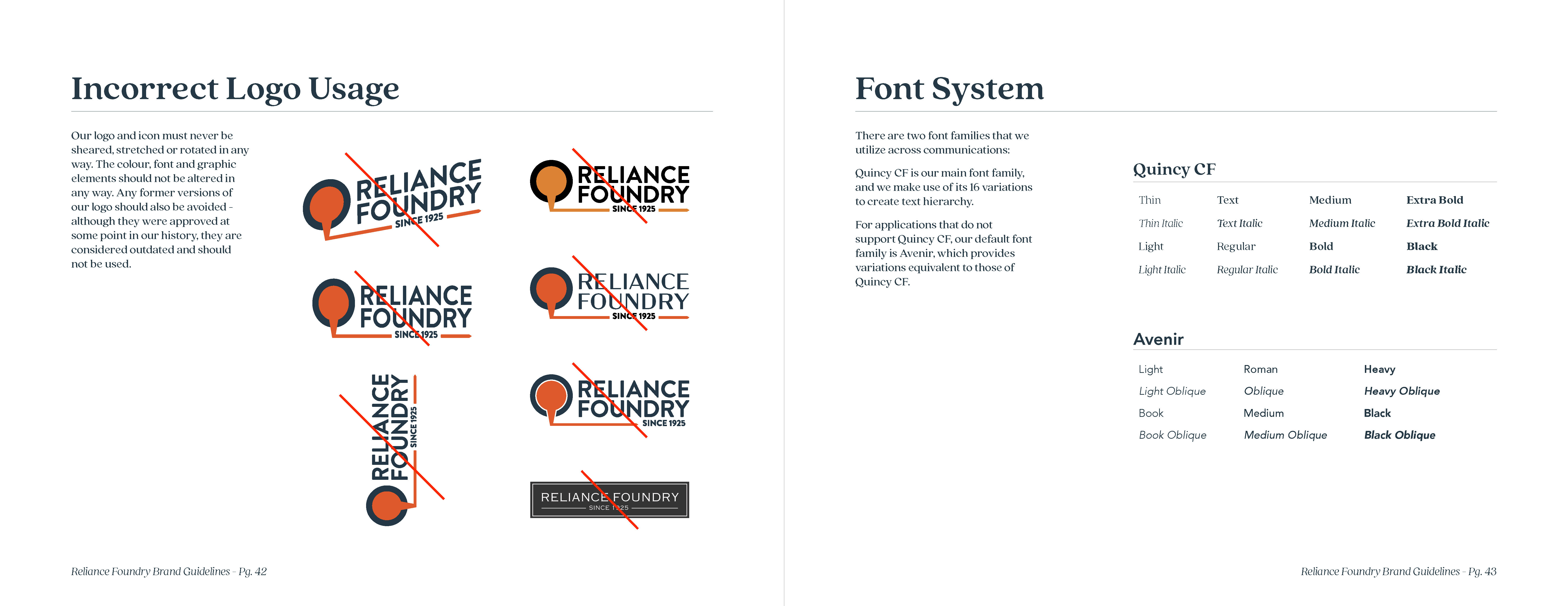
  • Spread showing incorrect logo usage, and the font systems.
  • Spread listing the primary colour palette, and the extended colour palette with 24 tones.
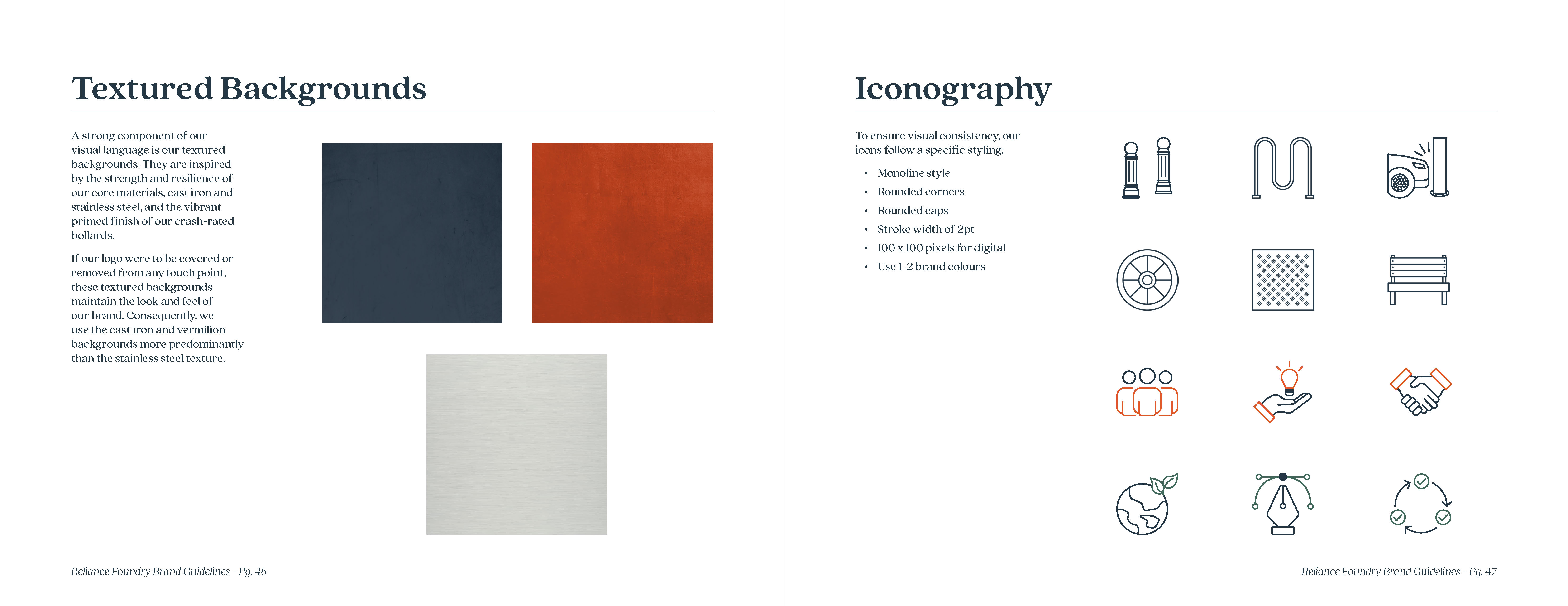
  • Spread introducing the 3 brand textures and examples of iconography.
  • Brand book back cover with the Reliance logo and company contact information.

WEB DESIGN & UX

Multiple landing pages and the homepage were redesigned based on user research and analytics to streamline the user journey.
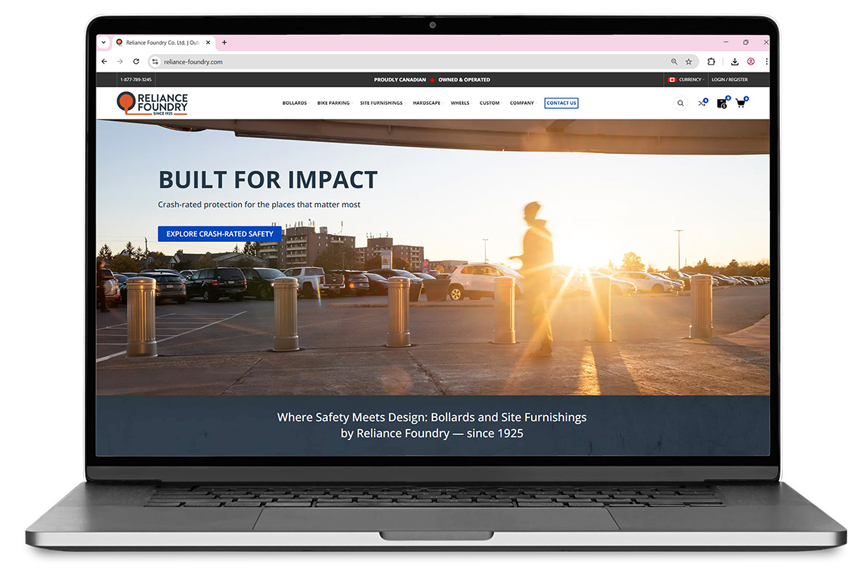
Laptop mockup with Reliance Foundry's web homepage. Hero image shows robust bollards against a shiny sunset whose light filters through a blurry pedestrian.

Hero image photographed by Jesse Gibb, RGD

TRADESHOW BOOTH

From custom patterns and complex icons, to stickers and merch giveaways, this extensive design project brought the Reliance Foundry brand to life at different tradeshows.
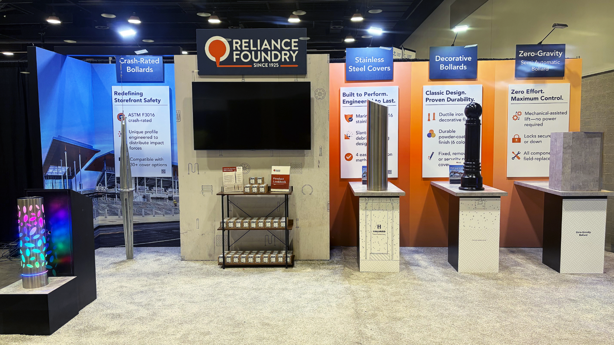
A booth displaying wrap-around graphics, a display screen, merch display shelves, colourful lit up bollard, clean light carpet, and decorative bollards on counters for interactivity.

Booth structural design and manufacturing by Westkey-Xibita.
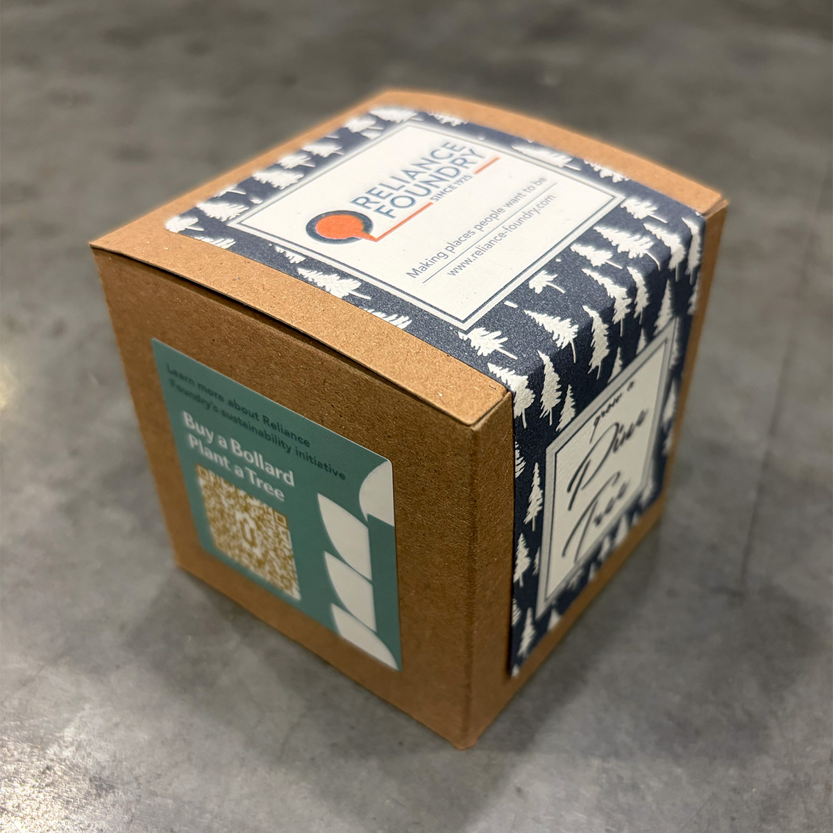
Small brown cubic box with Reliance Foundry's logo, and a sustainability sticker on the side.

Pine tree seedling branded give-away.

TRADESHOW COLLATERAL

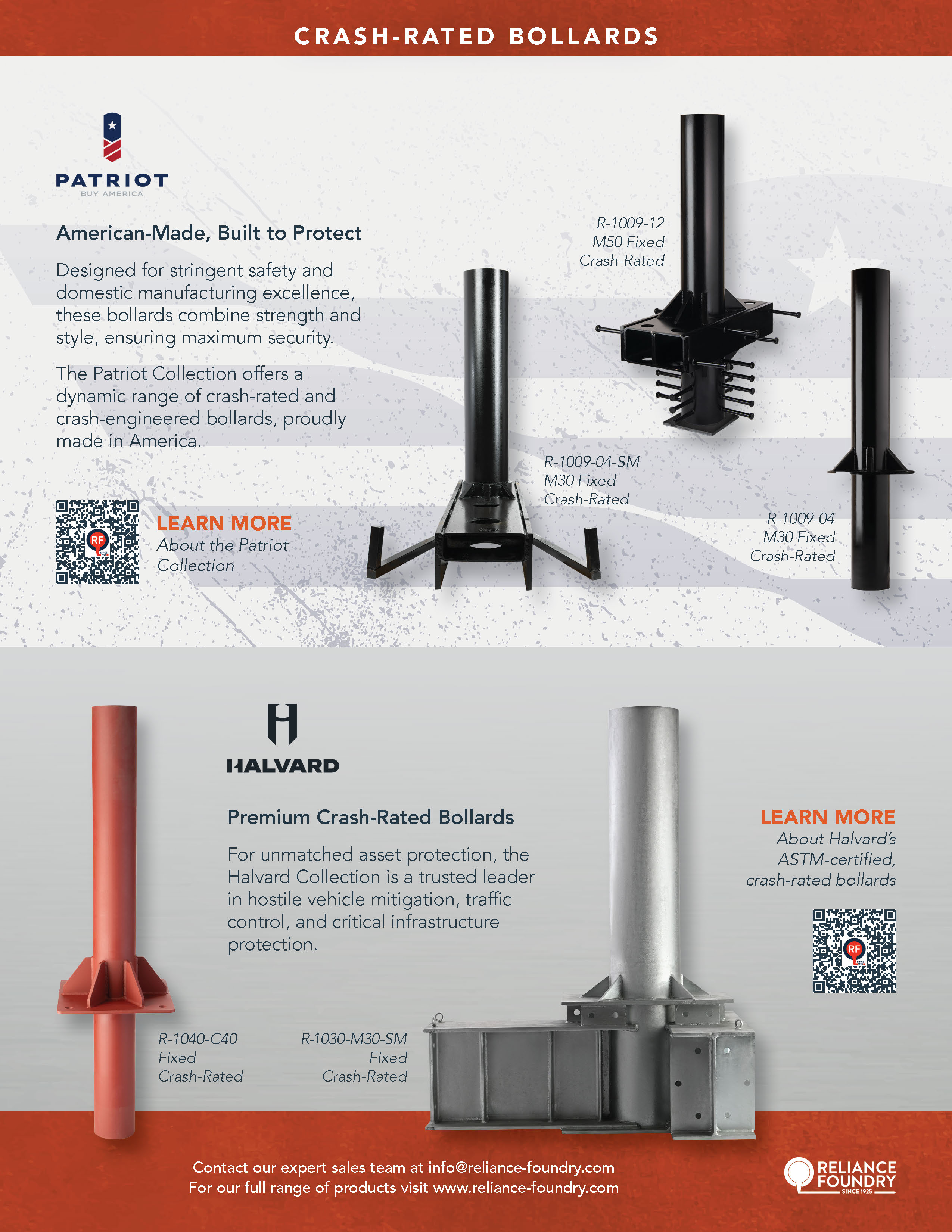
Featuring key sub-brands, this 2-sided print project has trackable QR codes for post-show analytics.
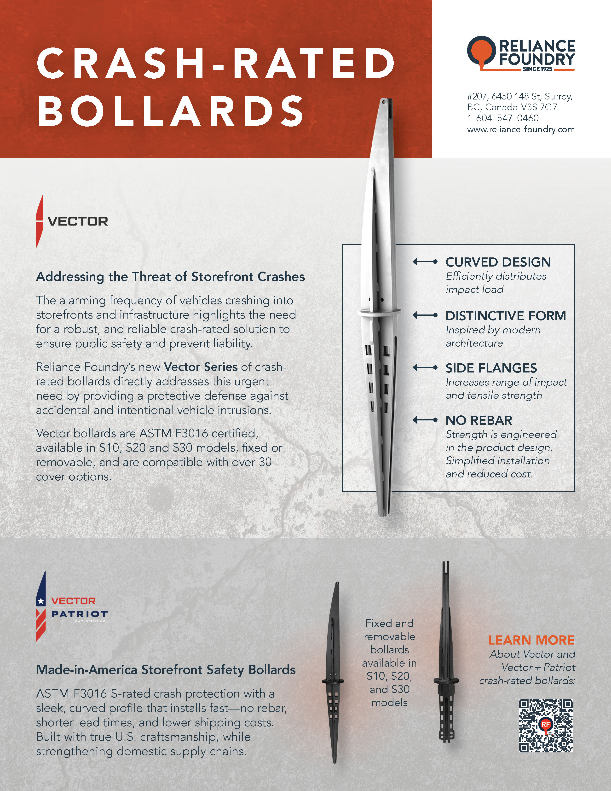
First page of a flyer  displaying Reliance Foundry's Vector crash-rated bollards, their key features and a QR code that takes readers to the Vector landing page.
Second page of a flyer showing the Patriot and Halvard collections of crash-rated bollards, with QR codes to their respective landing pages

DIRECT MAILER

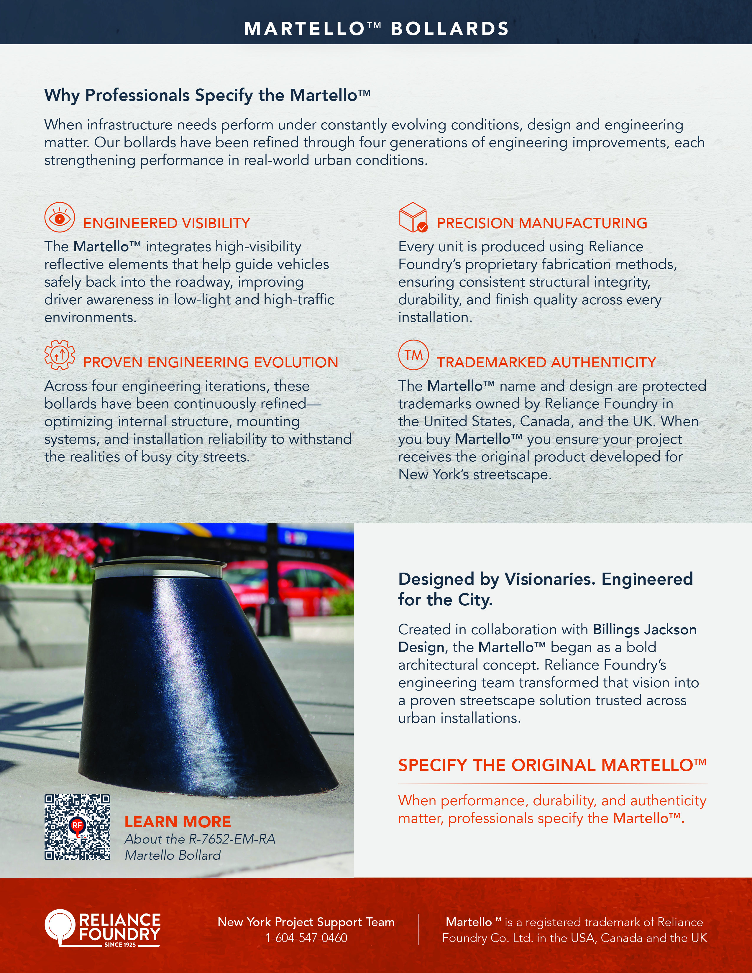
A product-specific promotional material targeted to architects and contractors in NY.
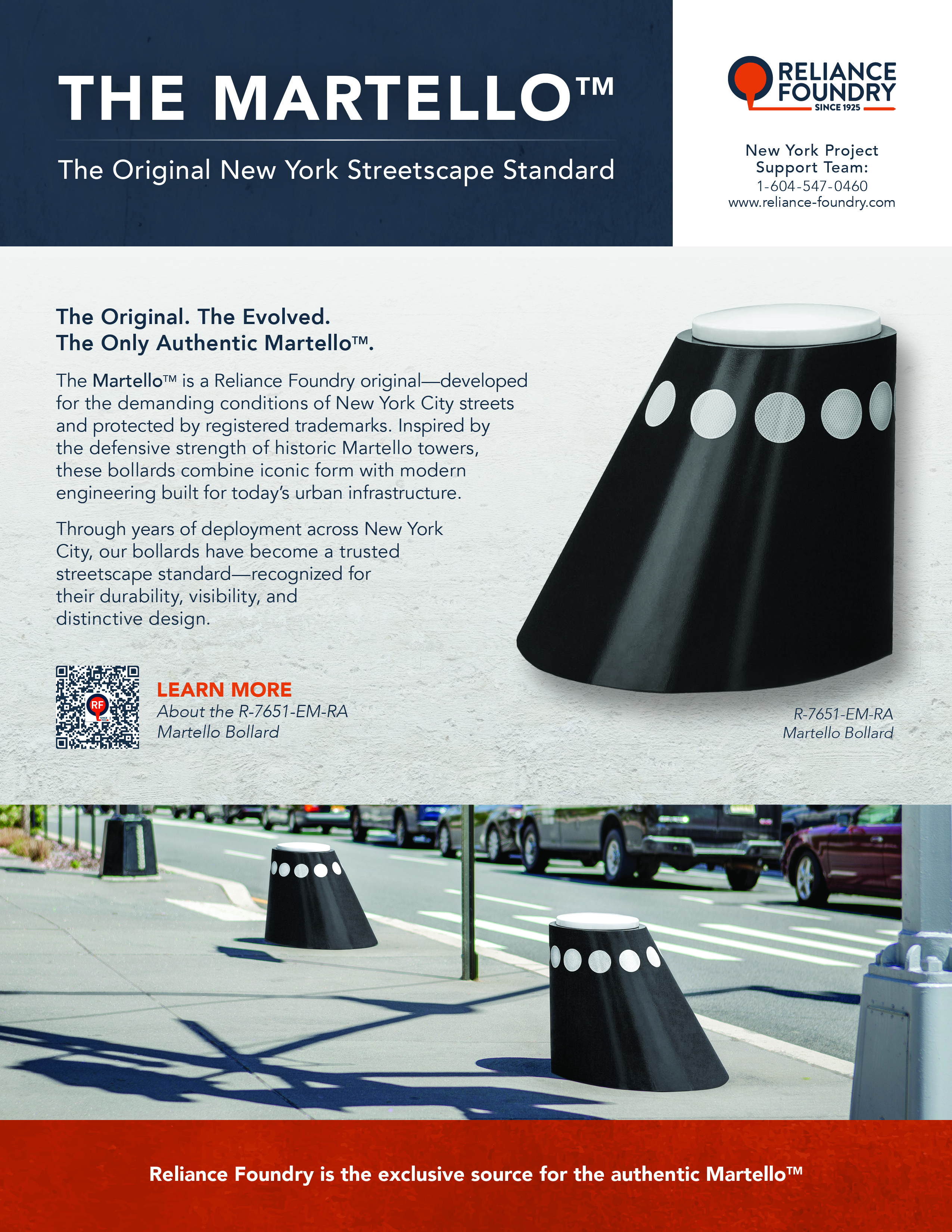
Front page of the Martello brochure, explains why this bollard is the original New York streetscape standard for safety.
Second page of the Martello brochure, which explains key features like engineered visibility and trademark authenticity.

ICONOGRAPHY

A collection of icons developed to scale across product categories, landing pages, infographics, tradeshows, slide decks, etc.
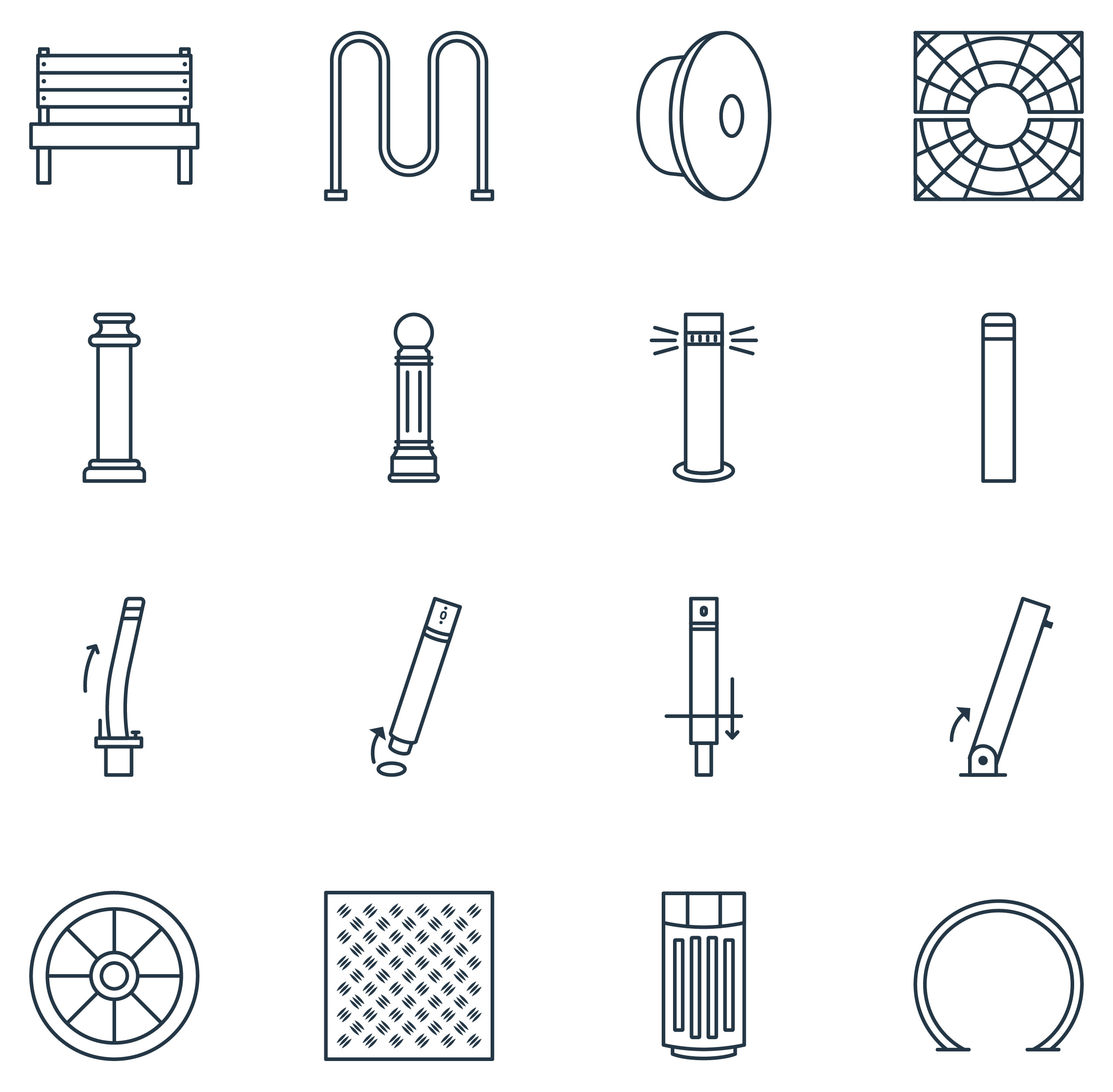
A collection of consistent, monoline icons in dark blue representing different product categories.

For all projects:

Copywriting: Ryan Fisher | Front End Dev: David Hilscher | Executive Sponsor: Michael Dalzell | Design Support: Taylor MacDermid | Photographers: Pablo Su, Jessica Hughes, Nomoto & Co., Lindsay J. C. Lack, Kateland Clarke, Felipe Jasso, Jesse Gibb RGD, Lucas J. Diack, and myself.